Welcome to my refrigerator door series. This series will consist of several posts showing options for the design of the refrigerator door. My first post of this series focused on hiding refrigerators in a kitchen. Click here to see it.
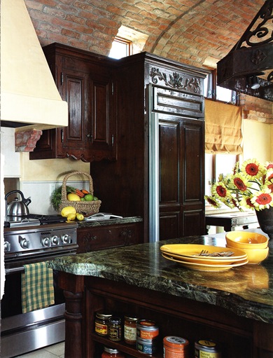
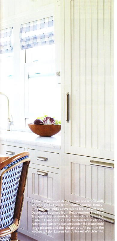
This post will focus on matching single refrigerator door panels with the cabinet style and cabinet hardware. Depending on the style of the kitchen, I usually like having a refrigerator door panel that matches the cabinets as shown below. What about you?
Scroll on down for ideas and inspiration!
Source: Unknown. If you will contact me, I will note it.
^Imagine how different this kitchen would look if the refrigerator door did not match the cabinets. A stainless refrigerator would totally change the look of this kitchen.
Source: Trend Magazine Kitchen Issue Volume 25, No. 10
^Perhaps it is the angle of the photograph but doesn’t the refrigerator above sure looks extra wide? Do you think the lower door actually swings open or does it pull out like a drawer?
Source: Kitchen Ideas That Work a book by Beth Veillette
^The black hardware on this refrigerator door as well as on the cabinets is a great accessory to this bead board look. I like the appearance of having four drawers below the single door though there are only two drawers. I do not have a photo of the entire layout of this kitchen but it seems to me that the door handle on this refrigerator should be on the right giving you a counter to place items you have taken out of the refrigerator or plan to put in. Though there is one problem with the door handle being on the right which would be the short wall to the left. It would prevent the door from opening more than 90 degrees. A refrigerator door needs to be able to swing open more than 90 degrees in order to clear the door shelves when removing the drawers and shelves.
Source: The New Smart Approach to Kitchen Design a book by Susan Maney
^Another example of the beadboard look is shown above. The island in this photo blocks the view of the entire refrigerator. I wonder if there is a drawer at the bottom of this refrigerator or if the door goes top to bottom? What do you think?
Source: Great Kitchen Ideas a book
^I like how the painted panel on this refrigerator matches the kitchen cabinets. However, I wish the cabinet hardware would have been used on the refrigerator. What do you think?
Source: Beautiful Kitchens Magazine Winter 2009
^I like how this refrigerator tucks in next to the brick wall. The panels are a great compliment to the kitchen cabinets.
Source: Kitchen Ideas That Work a book by Beth Veillette
^Above is an attractive kitchen wall unit with the refrigerator blending right in.
Source: Kitchen Ideas That Work a book by Beth Veillette
^One thing that struck me in the photo above was the use of three different hardware styles. The drawers differed from the cabinet doors and the refrigerator door was yet a third style. I feel the refrigerator door hardware is a bit small and would not be all that comfortable gripping. What do you think?
Source: House Beautiful Magazine March 2010
^Yet another beadboard style panel. I especially like the matching hardware with the refrigerator hardware being appropriately a larger size than the cabinet hardware.
Source: Beautiful Kitchens Magazine Spring 2010
^I ran across this magazine photo yesterday. It would have fit nicely in the first post of this series due to the refrigerator being hidden or disappearing. I wanted to share it with you so I added it here.
Without actually seeing the entire kitchen, what I do see in this magazine photo is a bit busy. You have upper cabinet doors lined with a print fabric. The cabinet drawers are a different color than the lower cabinet doors. There is natural wood that has been stained behind the open shelves. The island is a distressed black painted finish. The floor is natural stone pieces that vary. There is something on the other side of the island that appears to be a natural stained wood. On top of all of that, you have distressed wooden beams in the ceiling. What do you think?
Blessings. …susan
PS My next post in this series will feature double refrigerator doors. Do check back.


I love the matching paneling and hardware - it really unifies the look of the kitchen. I love all the images!
ReplyDeleteExcellent post! Having a refrig panel (or dishwasher) match the kitchen cabinets helps keep a kitchen timeless.
ReplyDeletexo,
cristin
You've done some fantastic research on your series! Installing panels on fridge doors is such a great, cohesive look in a kitchen. You've definitely shown us some great ones!
ReplyDeleteVictoria @ DesignTies
I like the designs that you are showing in this site. I believe that I could use these designs in my house. We're lucky to have this site that you made. Ill choose the colors that would match my natural skin care color so that the house would really represent me. thanks for posting.
ReplyDeleteLove reading your observations - you point out things that I never would have noticed as I am not a hardware person. I do think that little handle on the fridge would be too small...
ReplyDeleteThat's cool. I'm planning to do a DIY dream house with my wife, in preparation for our parents and some relatives' visit by next season. We're on the kitchen planning now, so I'm searching for ideas. The matchings of white goods are amazing, and how they fit into panel fridge doors looking like cabinets. Great!
ReplyDelete